Friday, August 17, 2012

Notes on the Note 10.1 (updated)

[Another, hrm, note: I've been reading a bit recently on the small Samsung Note, the 5.2 inch model (which probably will be updated soon). And I still think it may be the top contender for the perfect pocket-ereader! The screen is superply sharp, and the size is just right for hand-holding, and it fits in many pockets, especially thigh pockets. And it runs Android like a champ, nothing low-rent about it. I'm not the only one who like the size, they've sold ten million of them.]
-----------------------------

Here are comments and links to reviews of the new Samsung Note 10.1.
Update: notably (dang) David Pogue's review.

Two things are definitely interesting about the Note 10.1:

1) it can run two apps side by side on the screen.

2) it has a real pressure-sensitive pen.
(In a couple of weeks I should have my Jot Touch pressure-sensitive pen for iPad, we'll see how it is.)

The latter has been awaited eagerly mainly by artists, and the former by people who are into Apple's fabled post-PC age, where you are productive on the tablet. While this is great, and there are some excellent apps for the iPad, certain aspects of Apple's iOS hinders real success on it: the clumsy file system, where you can't freely get at your files, only through the app which made them. And the lack of ability to see two apps at the same time. Though I haven't had use for it myself, I think that Android is also stronger in the area of the flexibility of the file system. Apple has really sacrificed a lot on the alter of ease-of-use, for better and for worse.



"Apple's Secrets Revealed at Trial"

Apple's Secrets Revealed at Trial, article, Wall Street Journal.  Interesting peeks behind Apple's iron walls.

On Friday, Scott Forstall, a senior vice president who oversees the software used on the company's mobile devices, testified that as early as January 2011, an Apple executive advocated that the company build a tablet with a 7-inch screen. Apple has generally disputed the appeal of devices smaller than its 9.7-inch iPad, despite reports the company is developing a smaller model.
In cross-examination, Mr. Forstall said Eddy Cue, now head of Apple's Internet services efforts, had used a 7-inch Samsung tablet for a time, and sent an email to Chief Executive Tim Cook that he believed "there will be a 7-inch market and we should do one."

Interesting. I don't think they would have any reason to say this in court, unless there is a smaller iPad on the way.

Thursday, August 16, 2012

Habits are hard!


(More.)

Me, I love paper. Good paper. I even not long ago purchased some hand-made books from a one-man papermill in Italy, which are just wood covers and watercolor paper (hand-made). They are lovely.
But cheap copypaper is just... junk, really, isn't it? It's really historically just a filler until screens got good (and cheap) and light enough to read on. Which we have now with ereaders and tablets.
Students in universities for example have used an unholy amount of copy paper each year. For millions of dollars per year for just one big university. I hope tablets are already cutting into that waste.


Wednesday, August 15, 2012

Free-book resource

Here's a good resource for out-of-copyright books, in multiple ebook format and often in audiobook too! "BooksShouldBeFree". It's well designed, good interface, and seems to have reference to a *lot* of books. I actually immediately found two books from one of my fave authors which I had no idea existed, even in audiobook format (via the volunteer-work site Librivox). I haven't sniffed out yet how it all works, but it seems it is legit, not a pirate site.

Gates or Windows?

This (the sentence) is actually almost as old as the web, but it struck me that it's even more pertinent now, when we have new amazing platforms for using the Internet.


Monday, August 13, 2012

New Galaxy Note 10.1

I like my "mini-tablet" Samsung Note 5.2. It's a great pocket ereader. Now Samsung is bringing out a 10-incher. The video below is interesting. But beware: "sequences are shortened and screen images are simulated". Also, I can't really tell what's going on. But it sure shows things you can't do on an iPad, so maybe for some users it may lead somewhere interesting. (I'd suspect a small audience though, I don't think very many really want to use a stylus unless they have a very good reason.)


... In other news, there are voices saying that Android tablet sales are much worse than we even thought. Which would be bad, because Apple really needs the competition to be kept on their toes. A company with a de facto monopoly usually start slipping in areas like customer service and development.

Sunday, August 12, 2012

Oh no, podcast interfaces!! (Apple interface rant)

[Warning: rant time.]

So Apple just released a special app for podcasts for the iPad. I think yipee, because before this you had to depend on a computer to subscribe (or independent apps which didn't connect to iTunes). Also the interface of the iPad's music player is... sigh, I'm sorry, it's just awful, I haven't yet figured it out after two years! Well, I can use it, but it's ugly, non-intuitive, and very poor for podcasts/audiobooks.

To my joy, at first glance, the Podcast app's interface is clear as a bell. Big, clear buttons. And there's a 10-second backwards button and a 30-seconds forwards button. Kewl.

And then I saw it: get this... the app has no timeline. 

I'm just stunned. Say you want to go back 25 minutes to re-listen to a special segment, like an interview, you're basically boffed. Trying to do that with the little jump buttons, while not knowing where you are in the file (it does not even show how long it is!), is just ridic. I'm sorry, Fail to Apple for this.

The dedicated iPods with physical scroll wheels are OK for podcasts and audiobooks. Not great, but OK (For example, if you hold down the left button, it'll scroll back. Not with great precision, but it sort of works). But the iOS apps for them on iPod Touch, iPhone, and iPad need important changes to become really usable.

... No timeline... it's like building a car with no way to see the road.

Update:
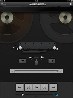
It was too stupid to be true. But the truth is also almost  too stupid to be true: you have to tap on the picture to reveal most of the control interface! No indications whatsoever that you have to do that. Hidden navigation, gotta love that.
Len wrote to me:
I think if you tap on my photo when the podcast is running the photo will roll up like a windowshade and reveal the timeline, along with a sort of superfluous image of an old-fashioned tape recorder. 

Yeah... It's sort of pretty (though very dark), but how many of Apple's customers have even seen one of these? I guess the people who hate the superfluous leather and stitching in Apple's Notes and Calendar apps really hate this part.

It reminds me of another pet peeve: the menus on the iPad very often do not show in any way that there is more menu hidden below the bottom item. No scroll bar, no arrows, nothing. And it's especially non-intuitive since the menus usually do not take up the whole screen. A good designer would fit as much as the menu into the space as he can, not hide half the menu, and especially not hide it in a way so it's not visible that there is more to find.
Example:
Perfect, complete menu, yes? (And notice the space under it, wasted.) Clearly these are all your choices.

Nope, if you happen to touch it in the right way, more is revealed:

I'm sorry to sound so bitter. Maybe it's because Apple normally does things so much better than everybody else, that it's a particularly harsh pill to swallow when they mess up, especially when a glaring error stand untouched for years.